CSS Triangle GeneratorGenerate CSS triangles using the border technique with direction and color controls.


CSS Triangle Generator
Generate CSS triangles using the border technique with direction and color controls.
Choose direction
Select which direction the triangle should point: up, down, left, or right.
Customize size and color
Adjust the triangle size and pick your desired color.
Copy the CSS
Preview the triangle and copy the border-based CSS code.
What Is CSS Triangle Generator?
The CSS Triangle Generator creates triangles using the CSS border technique, one of the most clever tricks in CSS. By setting an element's width and height to zero and using transparent borders on three sides with a colored border on one side, a triangle shape is formed. This tool lets you choose the triangle direction (up, down, left, right), adjust its size, and pick any color. The generated CSS is lightweight and requires no images or SVG. CSS triangles are commonly used for tooltip arrows, dropdown indicators, breadcrumb separators, and decorative design elements. The preview shows the triangle in real-time, and the code is ready to copy into your stylesheet.
Why Use Our CSS Triangle Generator?
- No images needed—pure CSS border technique
- Four direction options with customizable size
- Lightweight and performant alternative to image-based arrows
- Instant preview and one-click code copy
Common Use Cases
Tooltip Arrows
Create the arrow pointer for CSS tooltips and popovers.
Dropdown Indicators
Add triangle indicators to dropdown menus and selectors.
Breadcrumb Separators
Use triangles as visual separators in breadcrumb navigation.
Decorative Elements
Add geometric shapes to section dividers and design accents.
Technical Guide
The CSS triangle technique exploits how borders meet at element corners. When an element has zero width and height, the borders form triangular shapes where they meet. By making three borders transparent and one border colored, a triangle pointing in the opposite direction of the colored border is created. For example, border-bottom: 50px solid blue with transparent left and right borders creates an upward-pointing triangle. The triangle size is controlled by the border width values. For equilateral triangles, all border widths should be equal. For isosceles triangles, the colored border can have a different width. This technique can also create right triangles by making only one adjacent border transparent. CSS triangles render crisply at any resolution and are supported in all browsers.
Tips & Best Practices
- 1The triangle points opposite to the colored border direction
- 2Use matching border widths for equilateral triangles
- 3Combine with ::before or ::after pseudo-elements for inline arrows
- 4CSS triangles can be rotated with transform for custom angles
Related Tools


CSS Clip Path Generator
Create CSS clip-path shapes with polygon, circle, and ellipse presets.
 CSS & Design

CSS Tooltip Generator
Generate pure CSS tooltips with customizable position, arrow, colors, and styling.
CSS & Design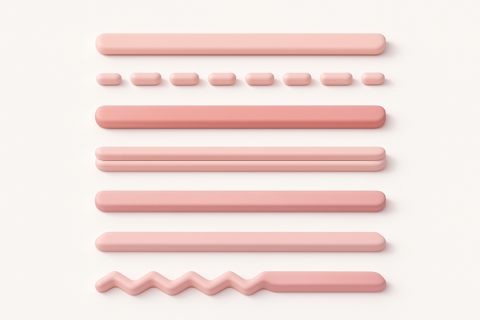
CSS Divider Generator
Generate CSS section dividers with multiple styles including gradient, shadow, and zigzag.
CSS & Design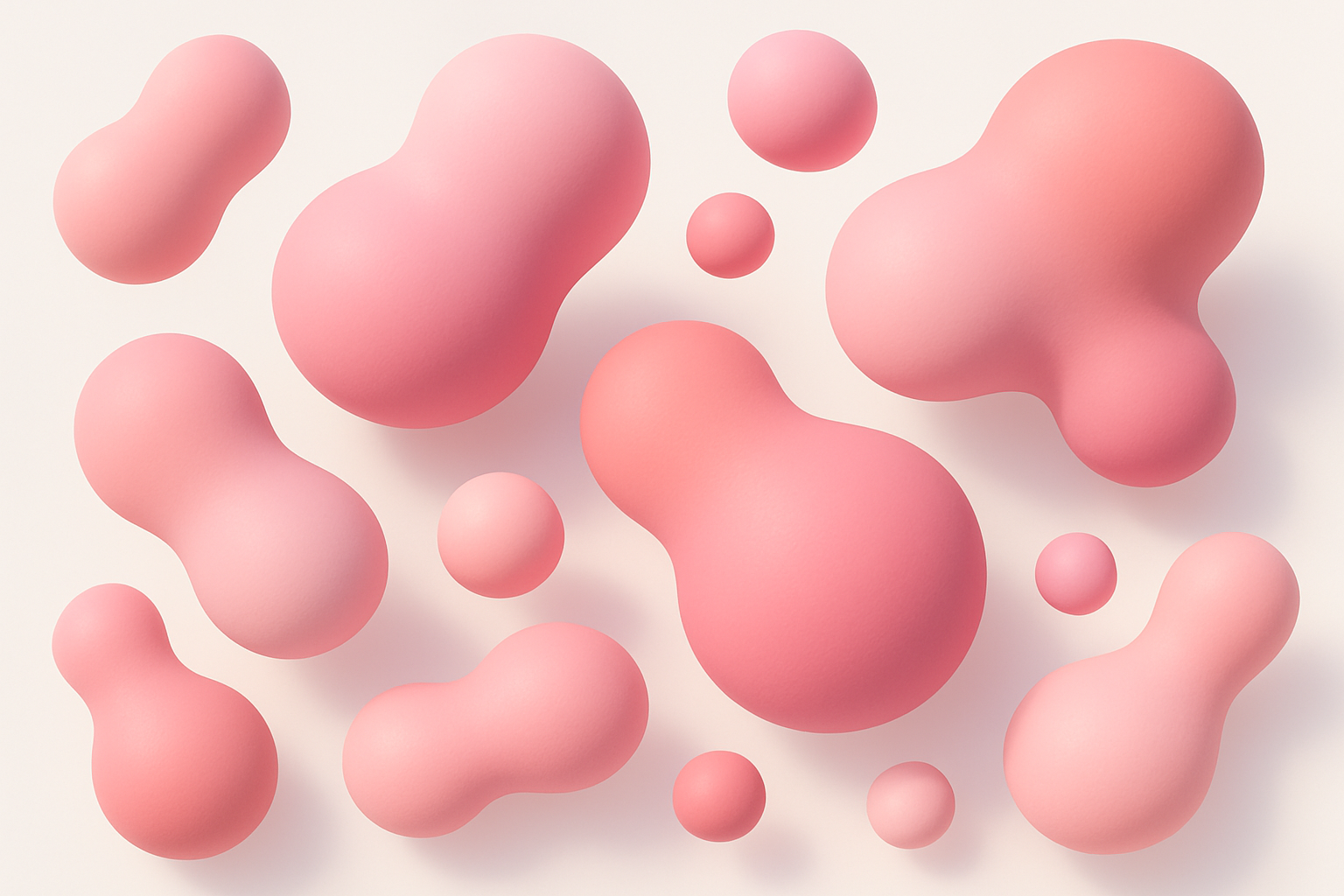
CSS Blob Generator
Generate organic blob shapes as SVG with gradient fills and randomization.
CSS & Design

CSS Gradient Generator
Create beautiful linear, radial, and conic CSS gradients with multiple color stops and angle control.
CSS & Design

CSS Box Shadow Generator
Generate CSS box shadows with multiple layers, inset options, and real-time preview.
CSS & DesignFrequently Asked Questions
QHow does the CSS triangle technique work?
QCan I create triangles pointing at custom angles?
QAre CSS triangles responsive?
QCan I create other shapes with borders?
QIs there a modern alternative to border triangles?
About CSS Triangle Generator
CSS Triangle Generator is a free online tool from FreeToolkit.ai. All processing happens directly in your browser — your data never leaves your device. No registration required. No ads. Just fast, reliable tools.