CSS Units ConverterConvert between px, em, rem, %, vw, vh, vmin, and vmax with configurable viewport and font size.
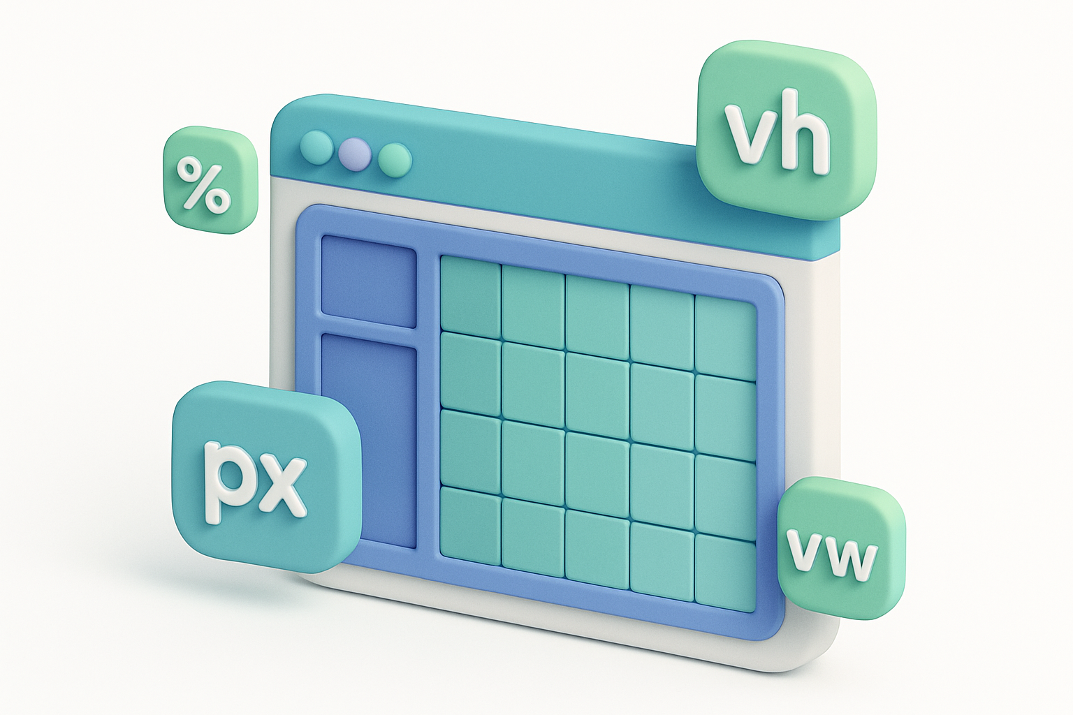

CSS Units Converter
Convert between px, em, rem, %, vw, vh, vmin, and vmax with configurable viewport and font size.
Configure context
Set your viewport dimensions, base font size, and parent element size.
Enter a value
Type the CSS value to convert.
Select units
Choose source and target CSS units.
What Is CSS Units Converter?
A CSS units converter translates between the various length units available in CSS, accounting for context-dependent units. Fixed units (px) always represent the same visual size. Relative units depend on context: em and rem relate to font sizes, % relates to the parent element, and viewport units (vw, vh, vmin, vmax) relate to the browser window dimensions. This converter lets you configure all context variables (viewport size, base font size, parent size) for accurate conversions between any CSS units, making responsive design calculations quick and precise.
Why Use Our CSS Units Converter?
- Configurable viewport dimensions for accurate vw/vh calculations.
- Adjustable base font size for em/rem conversions.
- Parent element size for percentage calculations.
- All eight essential CSS length units.
- Perfect for responsive design workflow.
Common Use Cases
Responsive Design
Calculate vw values for fluid typography and layouts.
Design-to-Code
Convert pixel-based design specs to responsive CSS units.
Accessibility
Convert fixed pixel sizes to relative rem units.
Layout Debugging
Understand how different CSS units translate to actual pixel sizes.
Technical Guide
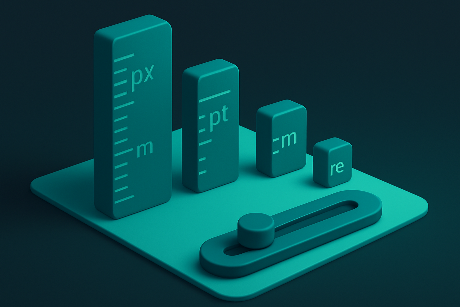
CSS length units fall into two categories: Absolute: • px: CSS pixel (1/96 of an inch in CSS, but 1 device pixel on standard displays) Relative: • em: relative to element's font-size. 2em = 2× the current font-size • rem: relative to root font-size (html element). More predictable than em • %: relative to parent element's corresponding property value • vw: 1% of viewport width. 100vw = full viewport width • vh: 1% of viewport height. 100vh = full viewport height • vmin: 1% of the smaller viewport dimension • vmax: 1% of the larger viewport dimension Common responsive patterns: • Fluid typography: font-size: clamp(1rem, 2vw + 0.5rem, 2rem) • Full-height sections: min-height: 100vh • Responsive spacing: padding: 5vw
Tips & Best Practices
- 1Use rem for font sizes (accessibility). Use px for borders and shadows (precision).
- 2vmin is great for responsive square containers.
- 3clamp() with vw units enables fluid typography without media queries.
- 4100vh on mobile may include the address bar — use 100dvh (dynamic viewport height) instead.
- 5When in doubt, start with rem and px. Add vw/vh only when you need viewport-relative sizing.
Related Tools
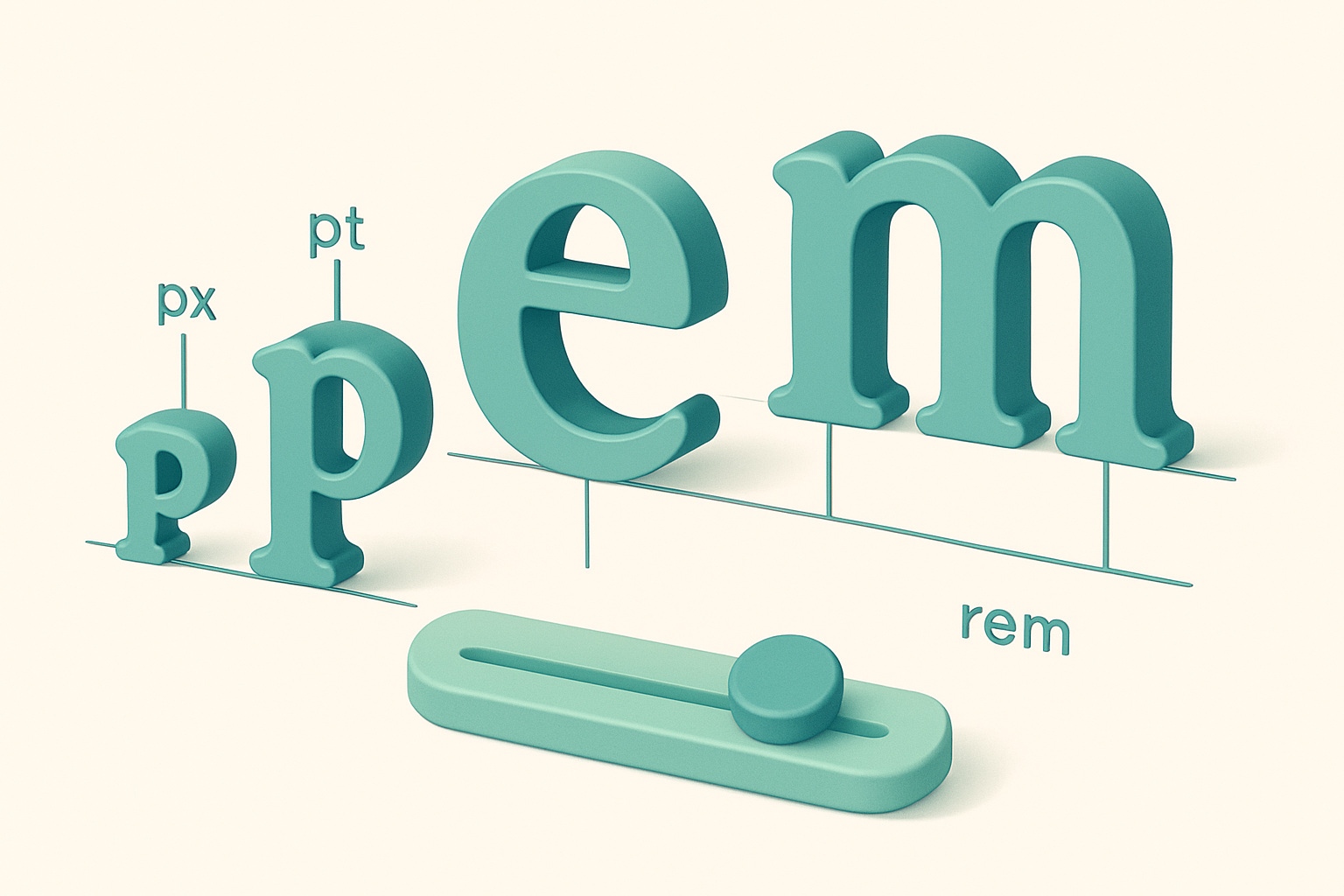
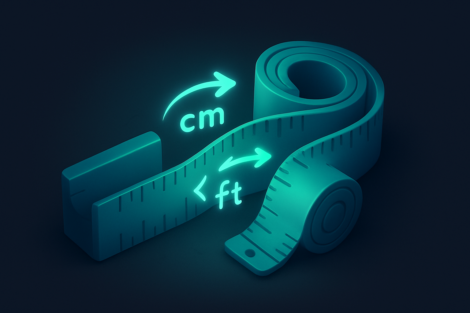
Typography Units Converter
Convert between px, pt, em, rem, cm, mm, inches, and picas with configurable base font size.
 Unit Converters
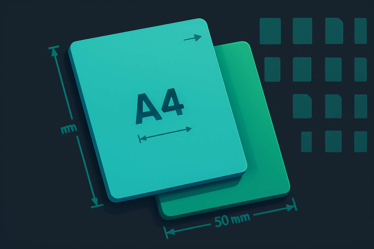
Paper Size Converter
Compare paper sizes: A0-A10, B0-B10, Letter, Legal, and Tabloid with dimensions in mm and inches.
Unit Converters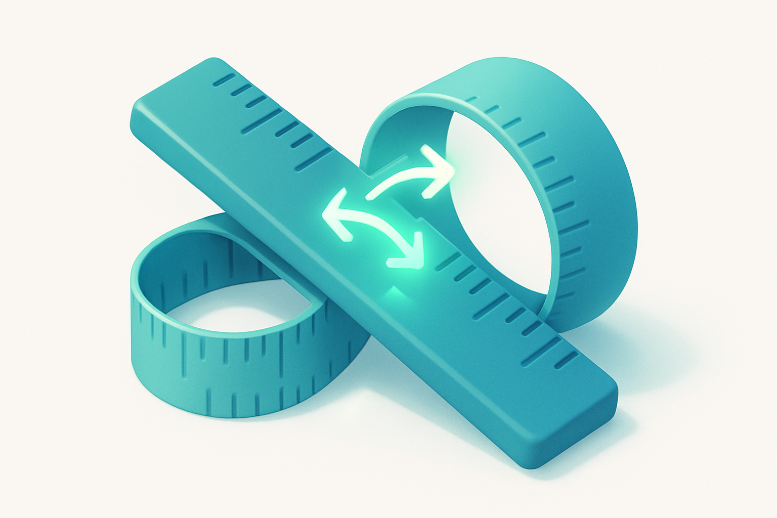
Length Converter
Convert between millimeters, centimeters, meters, kilometers, inches, feet, yards, miles, and nautical miles instantly.
Unit Converters

Luminance Converter
Convert between candela/m², nits, lamberts, and foot-lamberts.
Unit Converters

Weight Converter
Convert between milligrams, grams, kilograms, ounces, pounds, metric tons, and stones in real time.
Unit Converters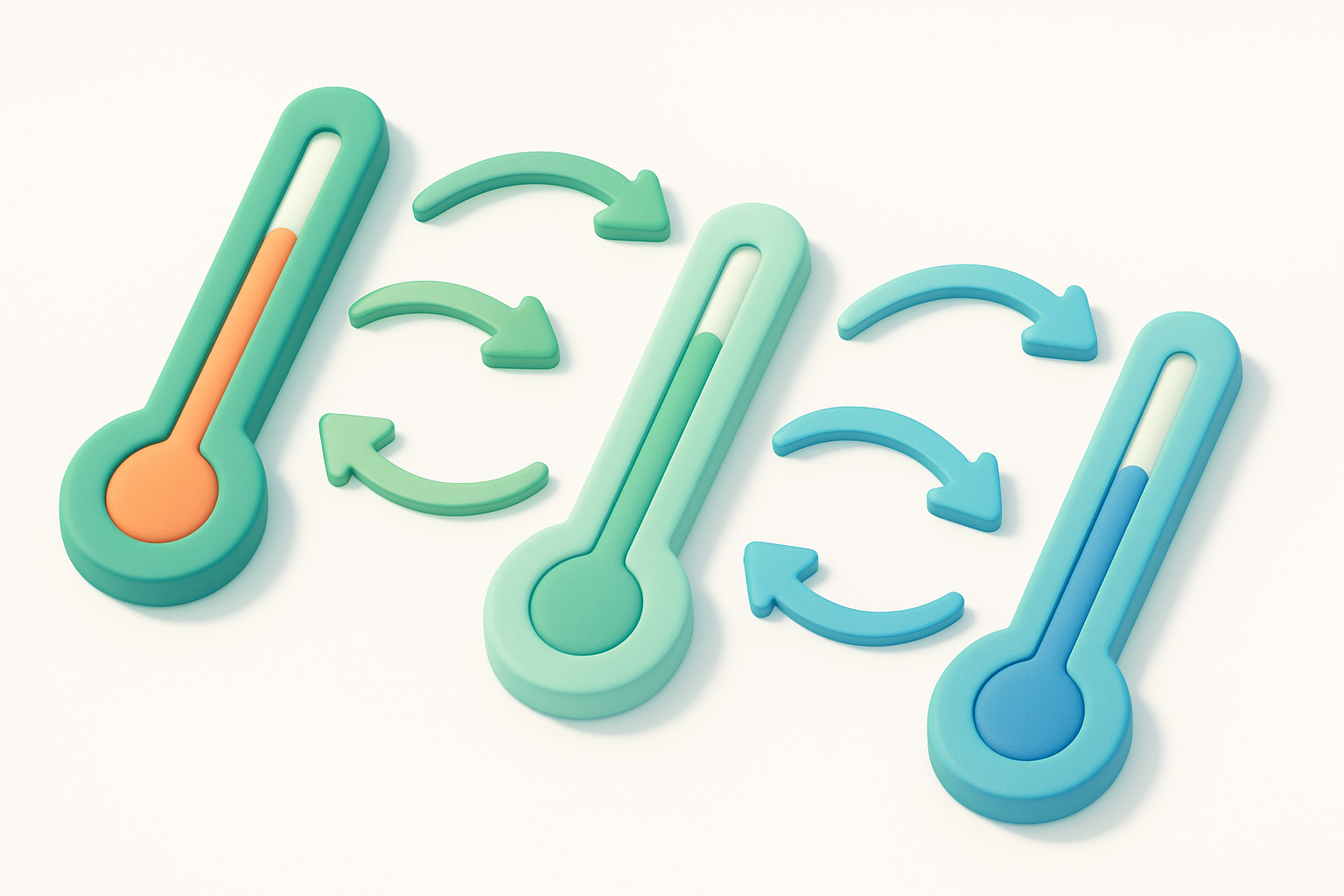
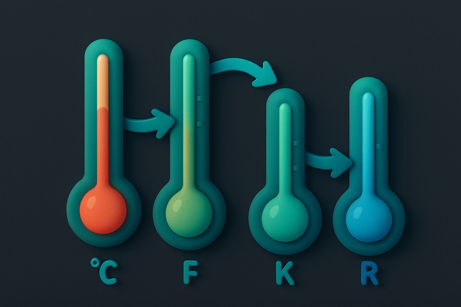
Temperature Converter
Convert between Celsius, Fahrenheit, Kelvin, and Rankine temperature scales with real-time results.
Unit ConvertersFrequently Asked Questions
QHow do I convert px to vw?
QWhat is the difference between vw and %?
QWhen should I use rem vs em?
QWhat is vmin?
QWhy do 100vh pages have scrollbars on mobile?
About CSS Units Converter
CSS Units Converter is a free online tool from FreeToolkit.ai. All processing happens directly in your browser — your data never leaves your device. No registration required. No ads. Just fast, reliable tools.