Typography Units ConverterConvert between px, pt, em, rem, cm, mm, inches, and picas with configurable base font size.
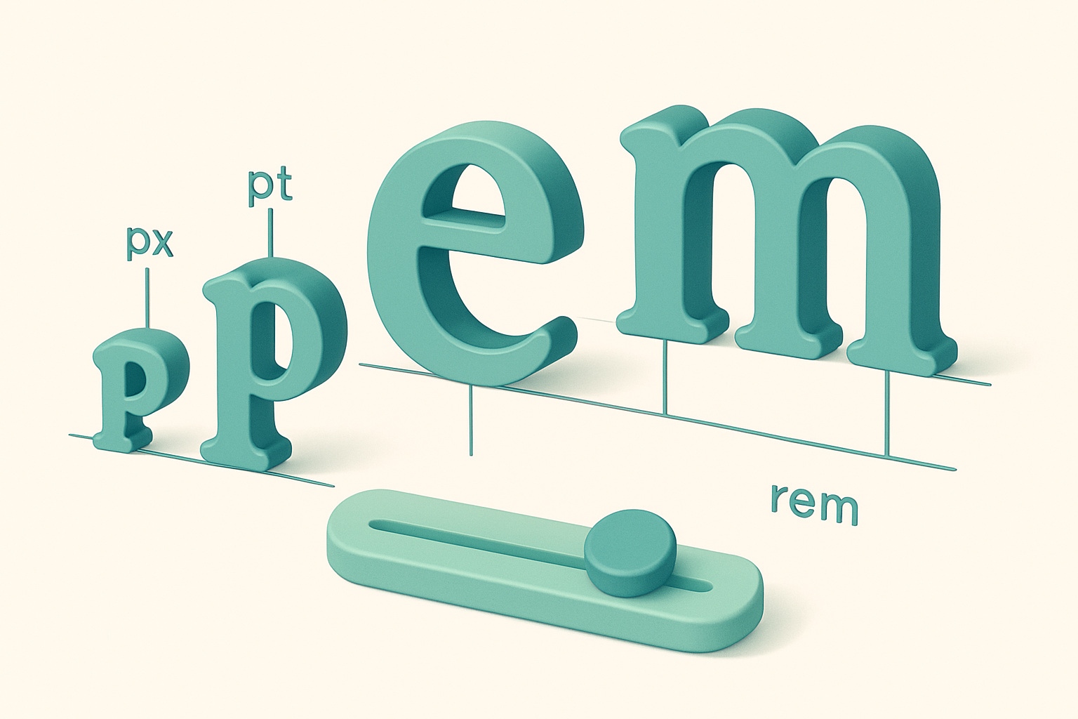

Typography Units Converter
Convert between px, pt, em, rem, cm, mm, inches, and picas with configurable base font size.
Set base font size
Adjust the base font size slider if your root font size differs from the default 16px.
Enter a value
Type the size value to convert.
Select units
Choose source and target typography units.
What Is Typography Units Converter?
A typography units converter translates between the various measurement systems used in digital and print typography. Pixels (px) are the standard web unit. Points (pt) are traditional in print design (1 pt = 1/72 inch). Em and rem are relative units — em is relative to the parent font size, rem to the root font size (typically 16px). Physical units (cm, mm, inches) and picas (1 pc = 12 pt) bridge print and digital contexts. The configurable base font size ensures accurate em/rem conversions matching your project's settings.
Why Use Our Typography Units Converter?
- Configurable base font size for accurate em/rem calculations.
- Bridges print (pt, pc, in) and digital (px, em, rem) typography.
- Essential for web designers and developers.
- Real-time conversion with reference table.
- Completely client-side.
Common Use Cases
Web Development
Convert between px, em, and rem for responsive typography.
Print Design
Convert between points, picas, and physical measurements.
CSS Authoring
Calculate rem values from pixel-based design specs.
Cross-Platform Design
Ensure consistent typography across web, print, and mobile.
Technical Guide
Typography measurement at 96 DPI (CSS reference pixel): • 1 px = 1/96 inch (CSS definition) • 1 pt = 1/72 inch = 96/72 px = 1.333 px • 1 pc (pica) = 12 pt = 16 px • 1 em = parent font size (default: 16px) • 1 rem = root font size (default: 16px) • 1 in = 96 px (CSS), 72 pt • 1 cm = 96/2.54 ≈ 37.8 px • 1 mm = 96/25.4 ≈ 3.78 px The CSS pixel is defined as 1/96 of an inch, regardless of the physical screen resolution. On high-DPI screens, one CSS pixel may correspond to multiple physical pixels. Em and rem are proportional units. At the default 16px base, 1rem = 16px, 0.875rem = 14px, and 1.25rem = 20px. Using rem for font sizes enables accessible scaling when users change their browser's default font size.
Tips & Best Practices
- 1At 16px base: 1rem = 16px. The "62.5% trick" (html { font-size: 62.5% }) makes 1rem = 10px for easier math.
- 21pt ≈ 1.33px. Print's 12pt body text ≈ 16px on screen.
- 3Use rem for accessible web typography — it respects user browser settings.
- 4Pica (pc) is still used in traditional typesetting: 1 pc = 12 pt = 16 px.
Related Tools


CSS Units Converter
Convert between px, em, rem, %, vw, vh, vmin, and vmax with configurable viewport and font size.
 Unit Converters
Paper Size Converter
Compare paper sizes: A0-A10, B0-B10, Letter, Legal, and Tabloid with dimensions in mm and inches.
Unit Converters
Length Converter
Convert between millimeters, centimeters, meters, kilometers, inches, feet, yards, miles, and nautical miles instantly.
Unit Converters

Angle Converter
Convert between degrees, radians, gradians, arcminutes, arcseconds, and turns.
Unit Converters

Weight Converter
Convert between milligrams, grams, kilograms, ounces, pounds, metric tons, and stones in real time.
Unit Converters
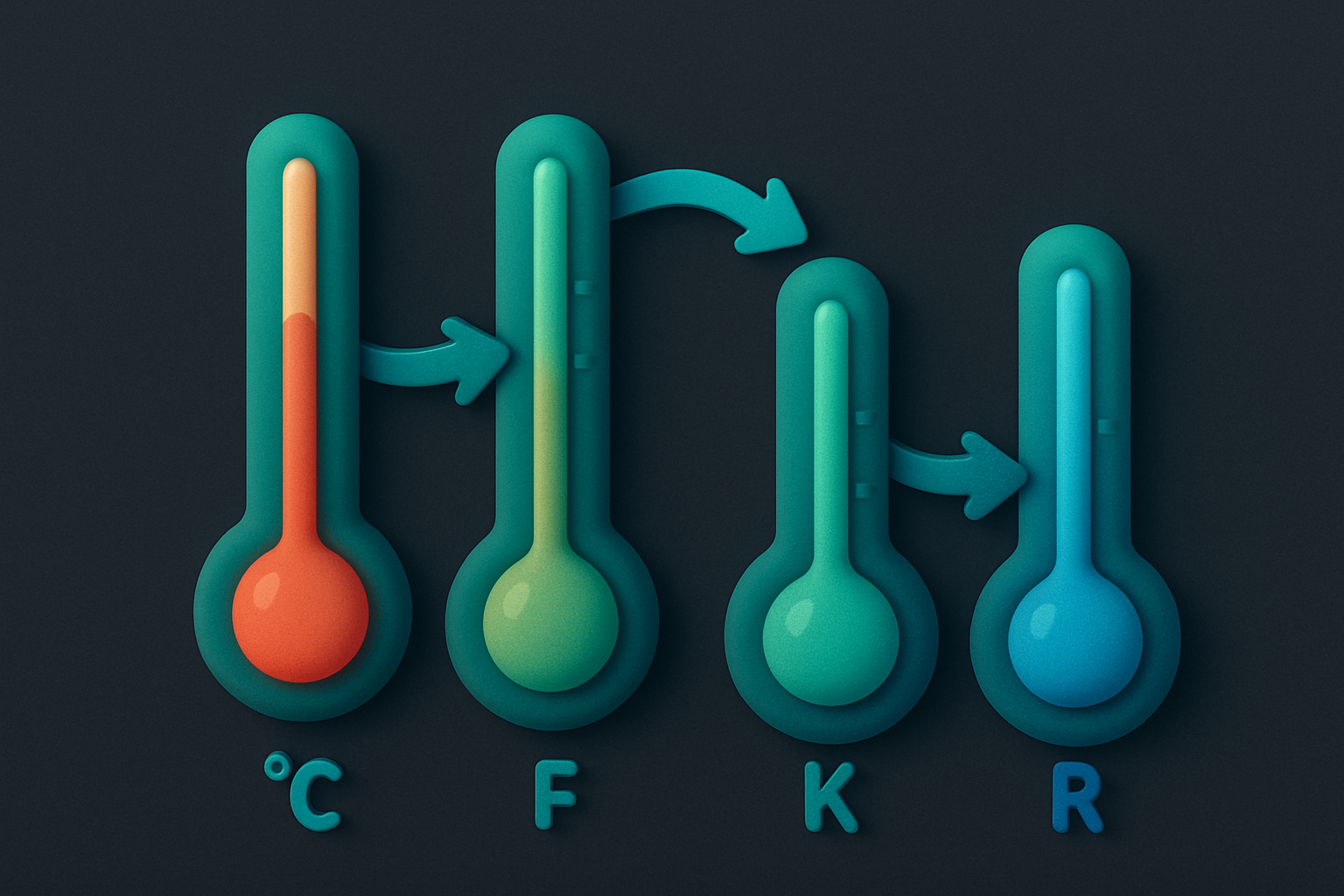
Temperature Converter
Convert between Celsius, Fahrenheit, Kelvin, and Rankine temperature scales with real-time results.
Unit ConvertersFrequently Asked Questions
QHow do I convert px to rem?
QWhat is the difference between em and rem?
QHow many points in a pixel?
QWhat is a pica?
QWhy is the default font size 16px?
About Typography Units Converter
Typography Units Converter is a free online tool from FreeToolkit.ai. All processing happens directly in your browser — your data never leaves your device. No registration required. No ads. Just fast, reliable tools.