Radial Gradient GeneratorCreate CSS radial gradients with custom shape, position, and colors.
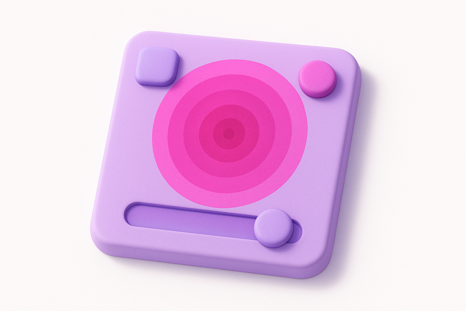
Radial Gradient Generator
Create CSS radial gradients with custom shape, position, and colors.
Choose Colors
Set the center color and the edge color for the gradient.
Configure Shape
Select circle or ellipse shape and set the center position.
Copy CSS Code
Copy the generated CSS code for your project.
What Is Radial Gradient Generator?
A radial gradient generator creates CSS gradients that radiate outward from a center point in a circular or elliptical pattern. Unlike linear gradients that transition along a straight line, radial gradients create spotlight-like effects, glowing orbs, and depth effects that are commonly used in modern web design. You can control the gradient shape (circle or ellipse), center position, and colors. The generator produces CSS radial-gradient() code that works in all modern browsers. Radial gradients are particularly effective for creating visual depth, spotlight effects on hero sections, decorative backgrounds, and subtle lighting effects that make flat designs feel more dimensional.
Why Use Our Radial Gradient Generator?
- Circle and ellipse shape options for different effects
- Adjustable center position with X/Y sliders
- Live preview updates as you change settings
- Clean, production-ready CSS output
- Free to use without signup
Common Use Cases
Spotlight Effects
Create focus-drawing spotlight effects on hero sections or product images.
Glow Effects
Generate glowing orb backgrounds for cards, modals, or decorative elements.
Depth & Dimension
Add visual depth to flat designs with subtle radial color transitions.
Vignette Effects
Create dark-edge vignettes over images for a cinematic look.
Technical Guide
CSS radial-gradient() creates a gradient radiating from a point. The syntax is: radial-gradient(shape at position, color1, color2). The shape can be "circle" (even radius in all directions) or "ellipse" (radius matches the element aspect ratio). Position uses percentage values (50% 50% is center). Size keywords like closest-side, farthest-corner control how far the gradient extends. Color stops work the same as in linear gradients. The browser interpolates colors from the center outward in concentric circles or ellipses. Radial gradients are compositable — you can layer multiple radial gradients using comma separation in background-image for complex effects like multiple light sources.
Tips & Best Practices
- 1Use "circle" for perfect round gradients and "ellipse" for aspect-ratio-aware shapes
- 2Position the center off-center (e.g., 30% 30%) for asymmetric lighting effects
- 3Layer multiple radial gradients for complex multi-light-source effects
- 4Use transparent as an edge color for subtle fade-out effects over backgrounds
- 5Combine with background-blend-mode for creative overlay effects
Related Tools
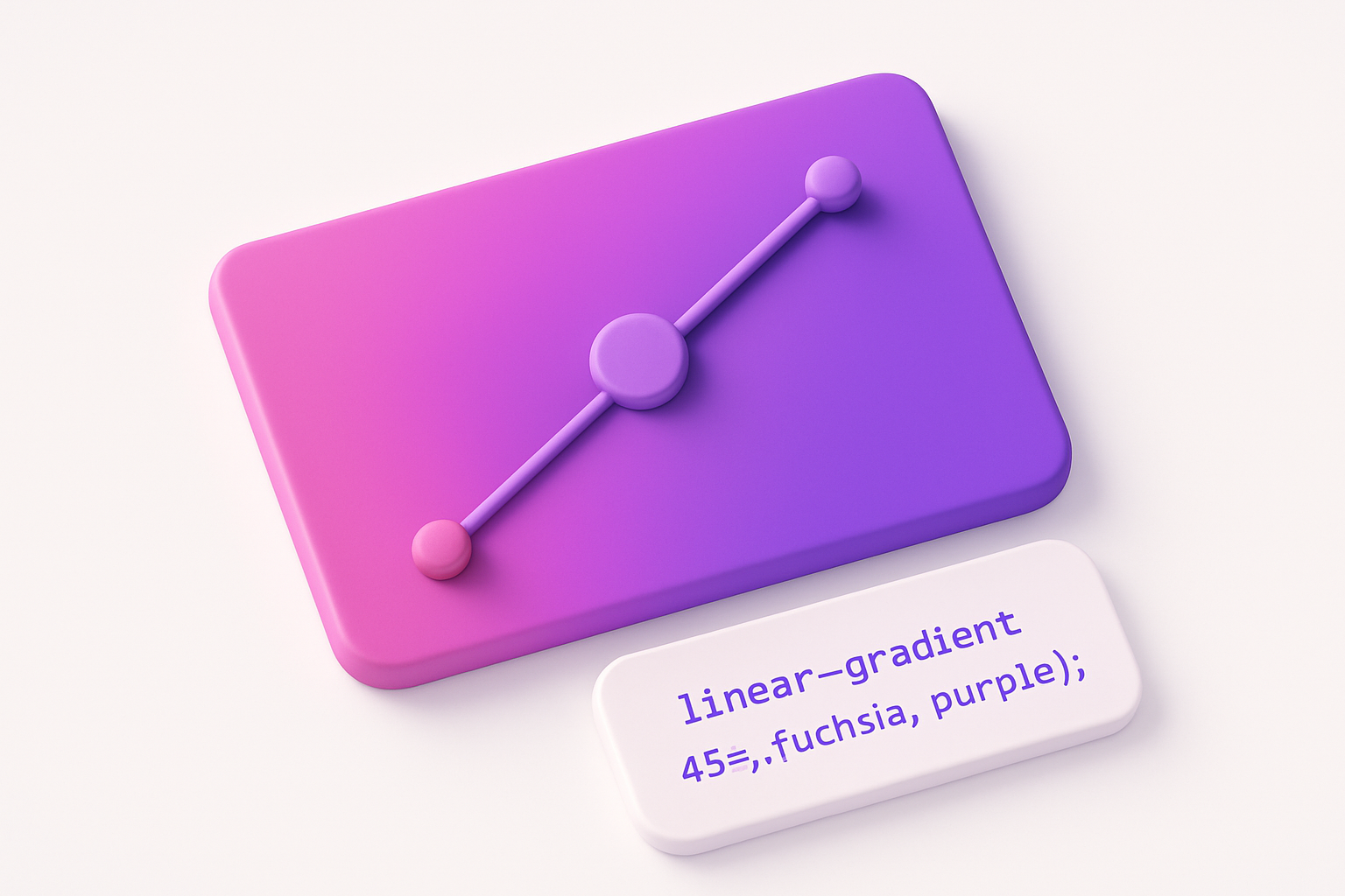
Linear Gradient Generator
Create CSS linear gradients with custom colors, angle, and color stops.
 Color Tools
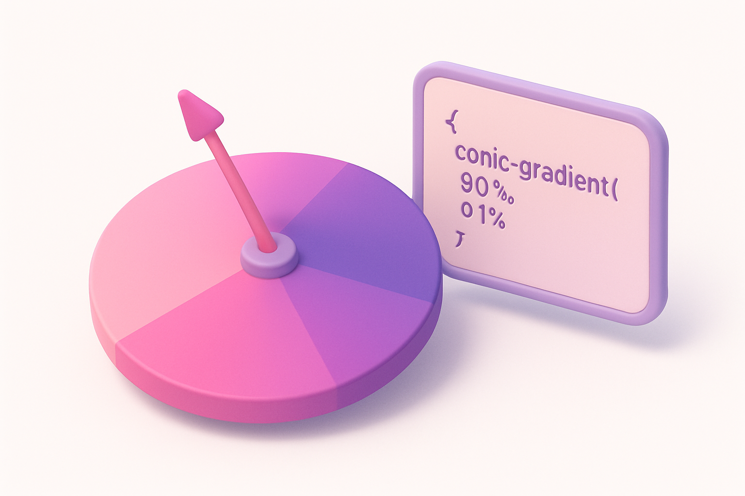
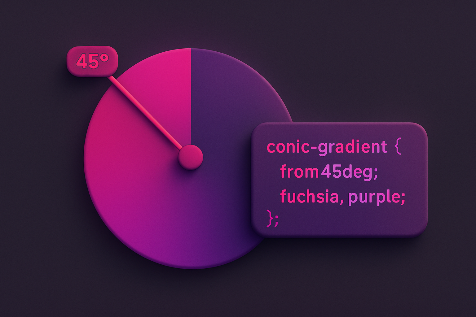
Conic Gradient Generator
Create CSS conic gradients for pie charts, color wheels, and sweeping effects.
Color Tools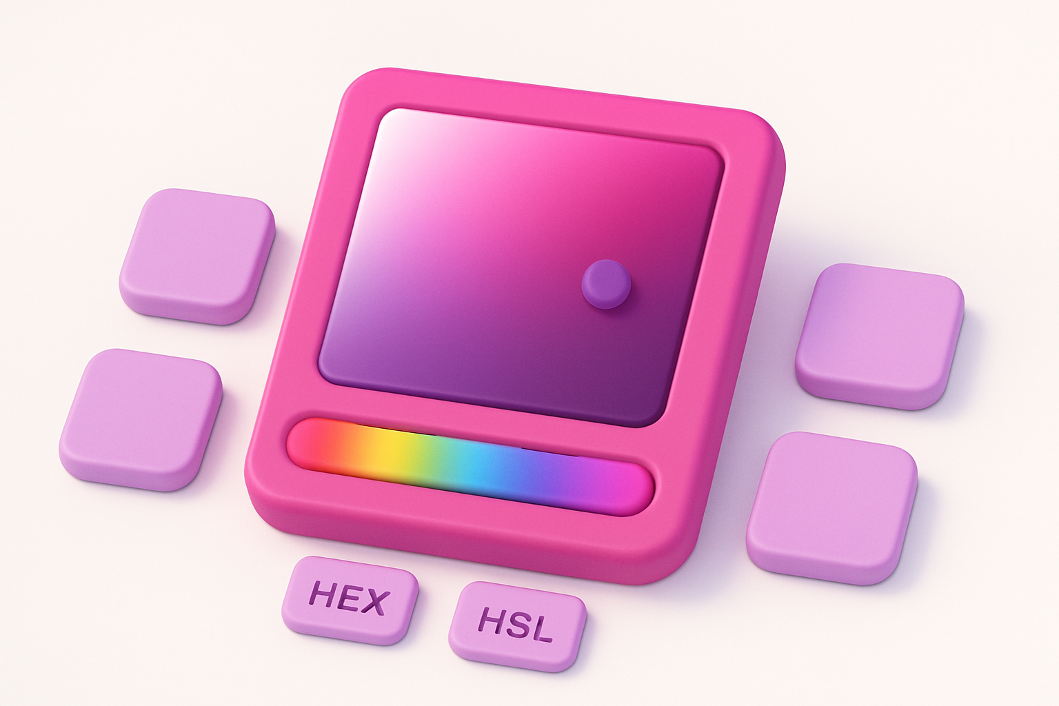
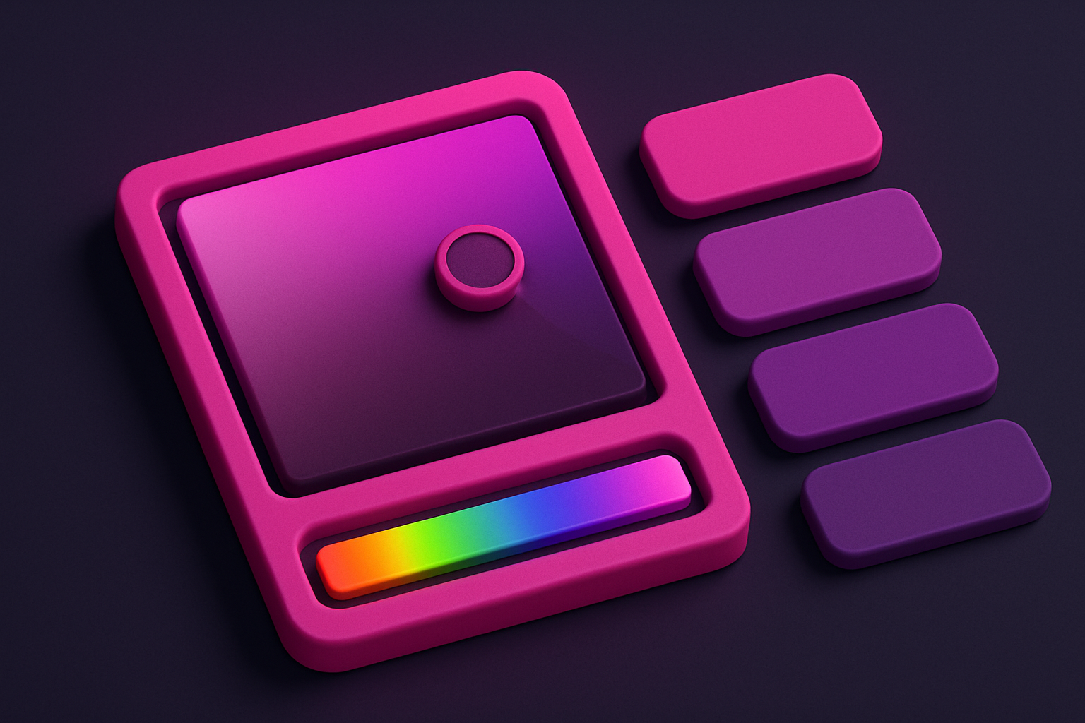
Color Picker
Interactive color picker with HEX, RGB, HSL, and CMYK outputs.
Color Tools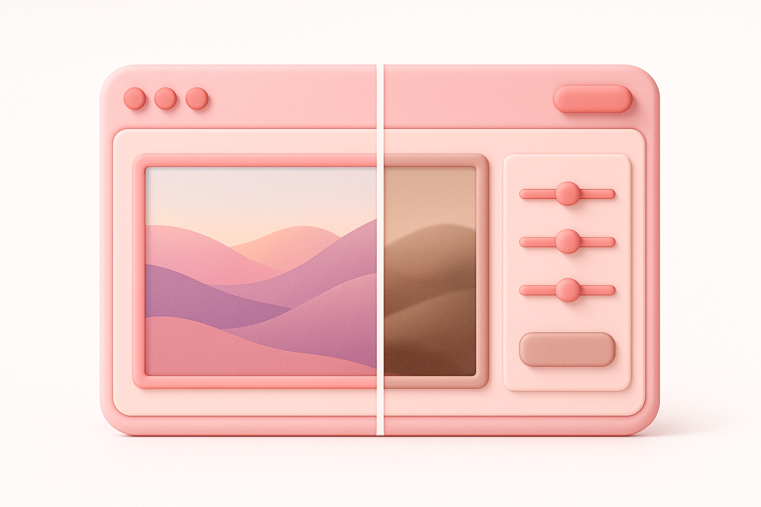
CSS Filter Generator
Apply CSS filter effects like blur, brightness, contrast, and more with visual controls.
 CSS & Design
Color Mixer
Mix two colors together with adjustable ratio and see the full gradient.
Color Tools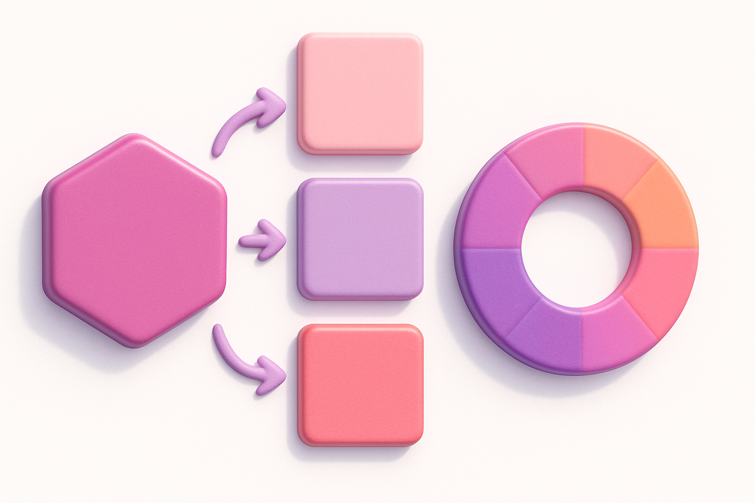
HEX to RGB Converter
Convert HEX color codes to RGB values instantly with a live preview swatch.
Color ToolsFrequently Asked Questions
QWhat is the difference between circle and ellipse?
QCan I position the center anywhere?
QIs radial-gradient supported in all browsers?
About Radial Gradient Generator
Radial Gradient Generator is a free online tool from FreeToolkit.ai. All processing happens directly in your browser — your data never leaves your device. No registration required. No ads. Just fast, reliable tools.